Exhibition Text:
MKE
Photoshop Manipulation
22.86cm x 40.64 cm
November 18, 2015
Milwaukee is in need of a new flag! Therefore I designed a couple of flags. This simple task was very challenging at first due to the lack of ideas, then it got very easy. Thankfully I was influenced/inspired by my surroundings and the research I did. I only used Photoshop to design my flag, and was helped by YouTube videos and other outstanding flags to get my final result. Some considerations I took were:
1. Keep it simple!
2.Use meaningful symbolism
3.Use 2-3 basic colors from the standard color set
4.No lettering or seals
5. Be distinctive
Process:
1. Draw rectangles for the flags ( maybe 6?) to draw down all your ideas. Later on you can compare them or combine them!
2. Research what symbolizes Milwaukee. Found information then thought of how I can put all the information I gathered into a symbol .
3. I combined my design with the research I did. Therefore I went to Photoshop to start working on my flag.
4. I looked up on google how to make triangles on Photoshop and color it, etc.
Inspiration:Inspiration I got from everywhere, my surroundings, YouTube videos , and my own research. I was mainly shocked by how Milwaukee was called out in this video:
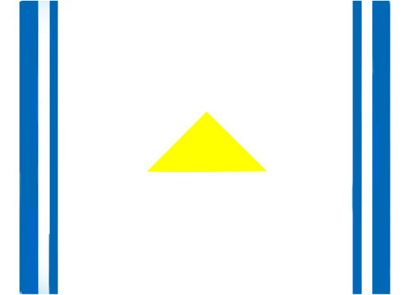
https://www.youtube.com/watch?v=pnv5iKB2hl4#action=share Not just the criticizing , it also provided examples of what's considered a decent flag and tips. Milwaukee has had one flag throughout all these years, in 2001, around 100 flags were designed to replace Milwaukee's current flag however none of them were chosen. It's never too late to change a flag! I found the Milwaukee Art Museum a huge inspiration. Every time I go there I see, the exterior design, a bird. The mourning dove, which symbolizes peace. I also found out that our motto is to go "forward", this was all part of my final result. 
"Morgan Sheff." Morgan Sheff. Web. 9 Dec. 2015.
|
|
Second Flag & Reflection :

Milwaukee's flag isn't the most eye-catching or dopiest, and can definitely have a way better flag. This city deserves a well put flag just like the rest of the cities and countries, such as Chicago, Tokyo, and Donetsk. Just recently, Milwaukee has been judged and criticized for its flag, how embarrassing. Making this flag was a stress, I felt very pressured due to the limited rules that had to be followed, mainly to keep it simple. I'm not very used to basic, I like graphic design , I enjoy it , as long as I can put my whole creativity into it. However I feel and know that I could have had better flags, more sophisticated ones. Perhaps if I could use more modern patterns and symbols. This project had a great income in my abilities to edit on Photoshop. I feel more confident on my editing skills and more relative with the tools it provides. I also got to experience on how to deal with the fact of 'basic' , rules and pressure.
"Doves Outline." Doves Outline. Web. 18 Nov. 2015.
