|
|
Exhibition Text:
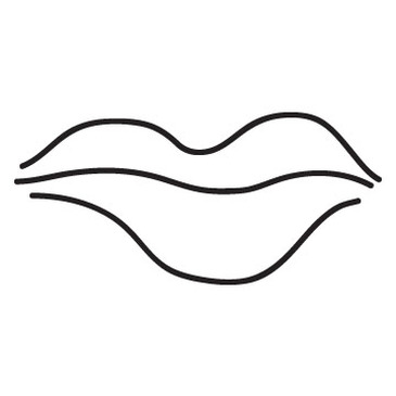
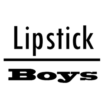
Lipstick
4in x 4in and 5in x 5in
Stickers, Photoshop, Illustrator
October 5, 2016
4in x 4in and 5in x 5in
Stickers, Photoshop, Illustrator
October 5, 2016
For my senior year, my goal was to challenge myself more and try new ways to express my opinions and ideas. I visited many galleries, and one that really caught my attention was a girl who had stickers as part of her project. The stickers were composed of different shades of pink, surrounding a character. I made two , one of lips and the other one with the quote 'lipstick/boys' . My main inspiration was Barbara Kruger, and the Post Modern movement. Aside from that , I had to limit myself, because a sticker can't be too much nor too simple, depending on the artist.
Process:
|
|
For my process, I began by drawing. I drew whatever came to my mind, like doodling. I took my sketchbook to all my classes, and whenever an idea came I drew. However I didn't like the results. I'm not a huge fan of drawing , but at the same time I wanted to challenge myself and draw. Plus, I didn't see why I shouldn't give it a try. I also had to do some research, on how I can make my drawing into a sticker, and well the process seemed very smooth. I started off by practicing on Illustrator, and it was stressful. It got more stressful when I decided to add color to the 'lips'. For the second part of my sticker, it was ' lipstick/ boys'. For that I played with the fonts, I wanted the upper part to be tall and skinny, and on the bottom , fat and long pauses between the letters. Therefore I didn't add any color. When it came to printing the stickers, I just bought sticker paper, put it on the printer and printed it. |
Meaning:The meaning behind the stickers is goofy and perhaps dramatic? Though the lips don't have a strong meaning, I can say it has culture. As a young adult, my generation is well informed on makeup, specifically in lipstick shades.The lip itself doesn't have a normal shape. Nobody does, because there's no general 'normal', normal is different for everyone. T 'Lipstick/ Boys' on the other hand is something a brat or a drama queen would say, at least in my opinion. For me it's like saying "Don't kiss a boy who isn't worth it, and keep your lipstick on, don't waste it on boys" . I found it funny and interesting for a sticker. Though, this can have different views and is welcomed to change the meaning of the viewer. If I were to put myself in different bodies, I could see how it 's transgender, a sign of female empowerment,/inequality. Or straightforward messages-- teenage problems or how society has changed and shaped individuals differently.
|
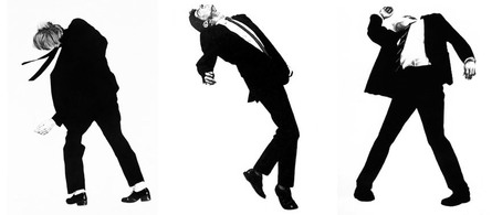
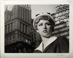
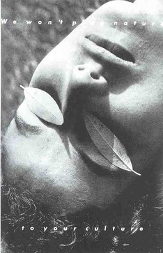
Inspiration:I was inspired by the Post Modern Art movement, and artists, Barbara Kruger, Cindy Sherman, and Robert Longo. As well as make up artists, such as Nazanin Kavara, her make up tutorials are very explanatory and she's also very well known, because of her make up tutorials and skills. . From Kavara, I got the shade of lipstick color. All these artists have something in common, is how they used white and black, manipulated it to make art. They also focused on a human's body and face. For example Robert Longo, used a man in a suit dancing, because black itself can't show much, so the man moving provides movement. Barbara Kruger however, she took photographs,and kept them in black and white. Bottom pic, she uses plants to cover her eyes, why? I don't know but she plays with the human's face. I also got the idea of making a quote from her, 'lipstick/boys'. She also played with the font of the words, either small or large.
|
Barbara Kruger, We Won't Play Nature to your Culture- 1983
Cindy Sherman, Untitled Film Still #2, 1978
Robert Longo, Men in the Cities, 1979
Cindy Sherman, Untitled Film Still #2, 1978
Robert Longo, Men in the Cities, 1979
ACT Questions: |
Reflection: |
|
1. The simplicity of stickers is to shoot the message straigforward, that's why it's black and white. A message is oftenly noticed when it's black and white, because color can take away the attention of the message. After the viewer sees the sticker, they either talk about how the design is street modern or the message behind (what it means to them)
2. My overall goal, was to try something new, which was drawing and the use of stickers. A sticker is suppose to be simple but also eye catching, and that's what I did, I tried to draw something my generation would take and put it somewhere, like their laptop. 3. I found new things about my generation, or at least the preference of teenagers. I found out we prefer aesthetic over culture, now a days we forget where we came from, and focus on modernizing. 4. My central idea, was to catch attention with a sticker, that has a simple drawing. Since my message isn't serious, I thought a simple sticker would fit. Another goal was to use a different method of showing how I feel, which was drawing using a drawing pen tablet. 5. A huge interest of mine was to discover how a sticker works, what it's mainly used for, the rules of it, and the process of making one. |
For this art project, I don't really have many "Oh I should've done this!" or "How did I forget this?" I think I did pretty good for my first time. I was scared at first, because I felt like it was going to be hard, and I thought I had to use a program to make stickers, but I managed to do it myself and the research helped a lot. I did hope to find more connections between my artwork and inspiration. Well at least clearer ones, something the viewers would notice right away. After this project I did find more stickers, also how popular they are, in restaurants, coffee shops, etc. The stickers I saw had more movement and were mainly black and white. They were either of flowers, prints, or a cartoon. Next time I use stickers to provide/show a message, I think I should do a cartoon, and provide more movement.
|
